

The anniversary logo of "Enlightenment 95"«
2025
Branding
Customer
GC "Prosveshchenie""
Briefly
We developed an anniversary logo for the Prosveshchenie publishing house.
branding,
guideline,
graphic design
«Prosveshchenie, one of the country's largest educational brands, is celebrating its 95th anniversary this year and entrusted us with the development of its anniversary logo.
1. Process
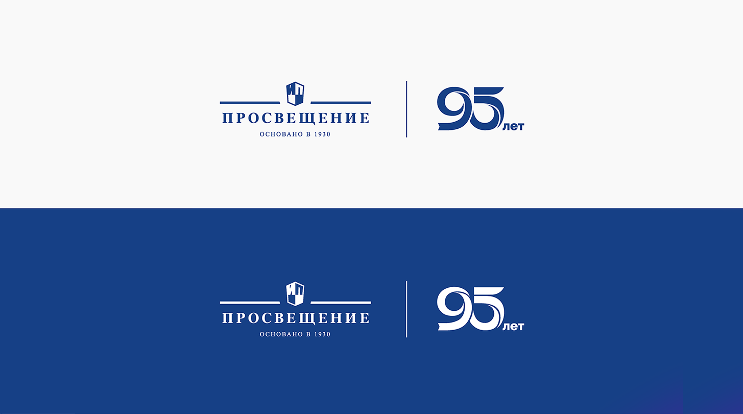
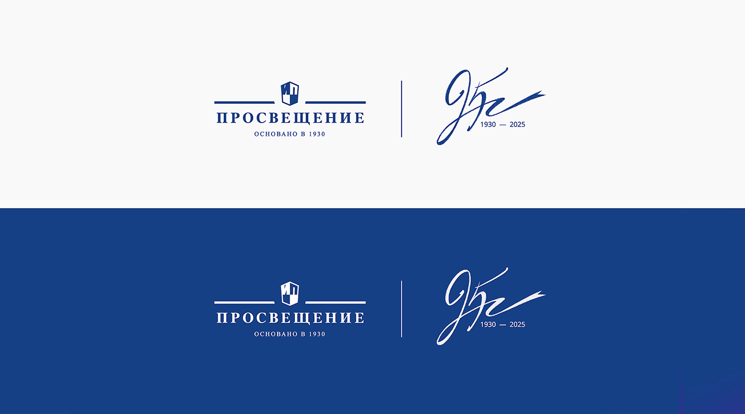
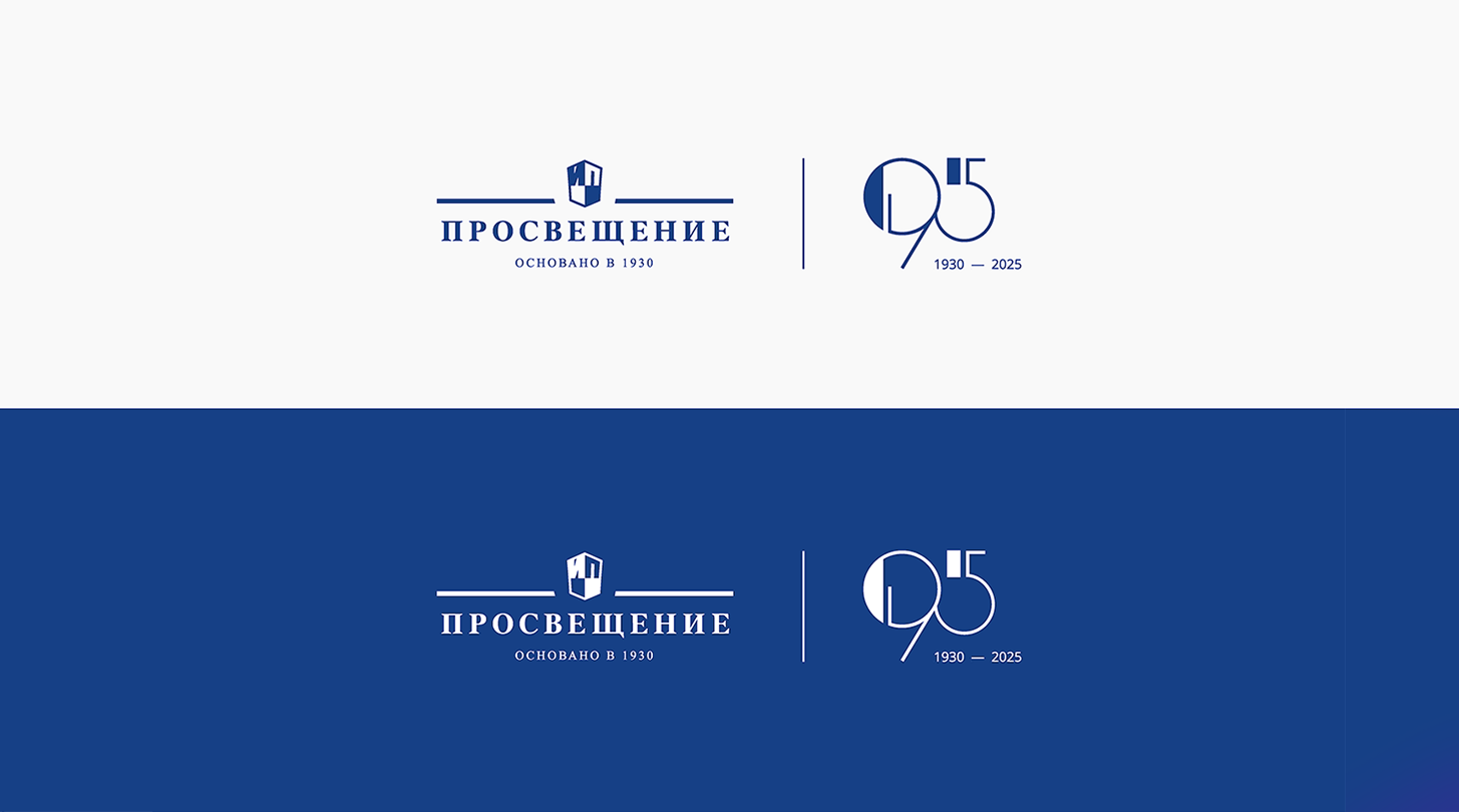
We developed three concepts for the anniversary logo. The first is a bookmark, symbolizing a connection to the book and a new chapter. The second is a handwritten number 95, adding a touch of humanity and reflecting the publisher's long history. The third is a combination of fine lines and rich shapes, emphasizing the continuity of generations. These options were based on the ideas in the brief, as well as the desire to convey the publishing house's many years of experience and development in the design.
1/3
2. Result
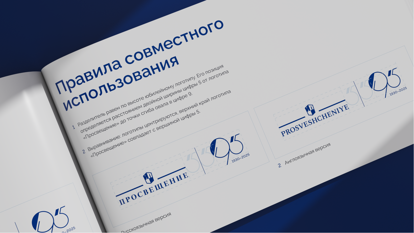
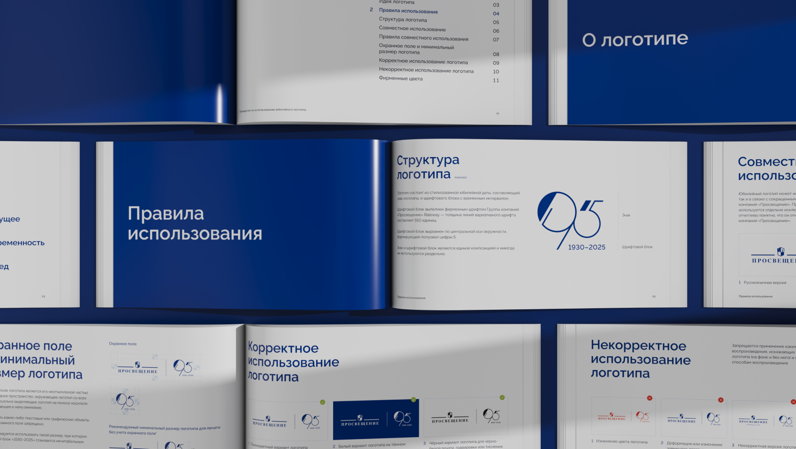
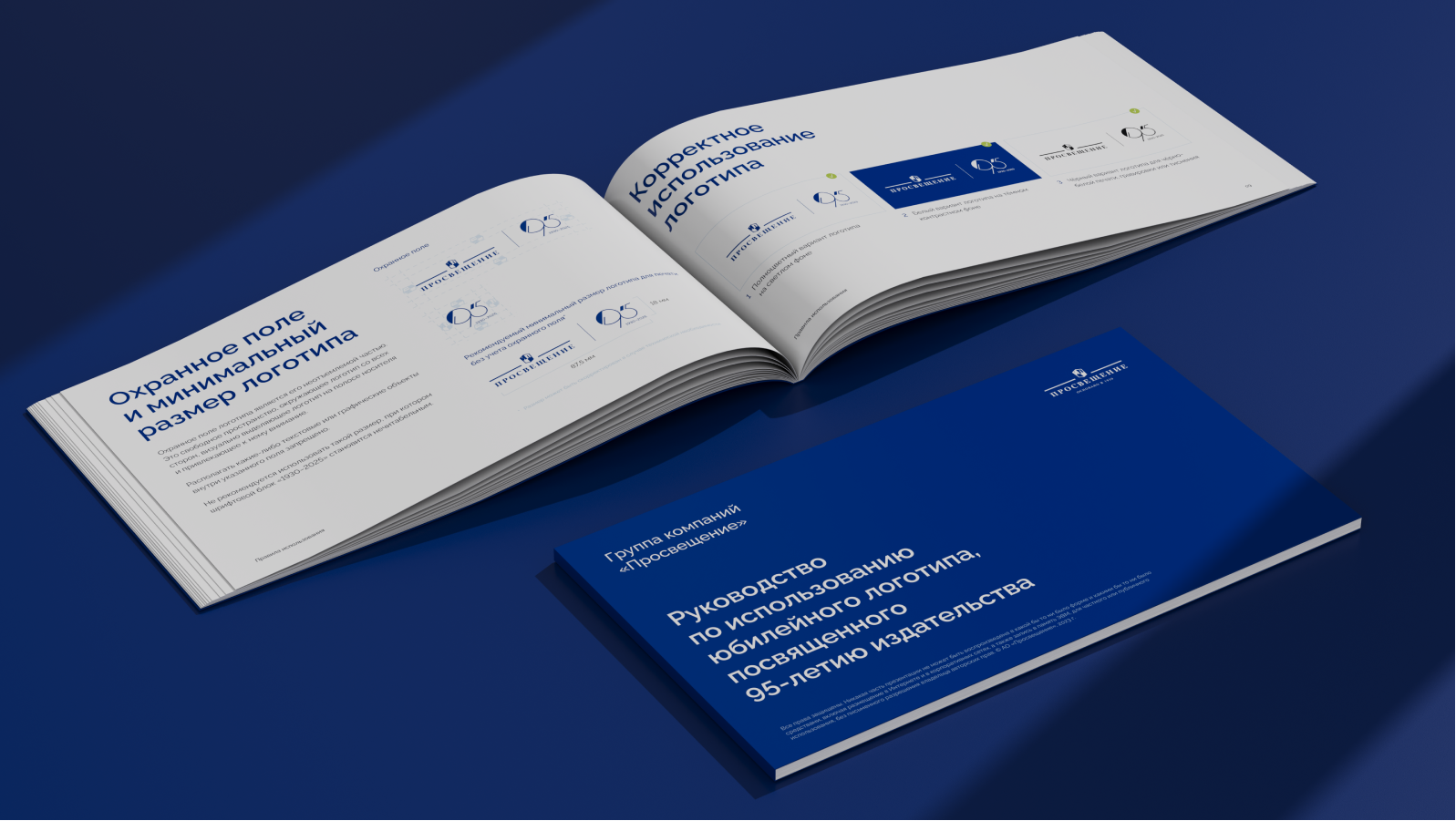
The logo we created reflects a dialogue between the eras of 1930 and 2025—the "Enlightenment" journey from classicism to modernity. The contrasting lines emphasize the connection between tradition and innovation. We also prepared a detailed logo book with usage guidelines. Today, this logo is successfully used by the publishing house across all its platforms, and we are proud to have contributed to this important chapter in its history.
1/3