
Corporate identity for the ECR
2025
Branding
Customer
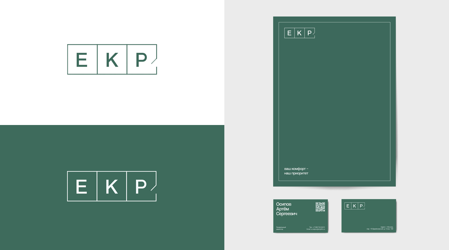
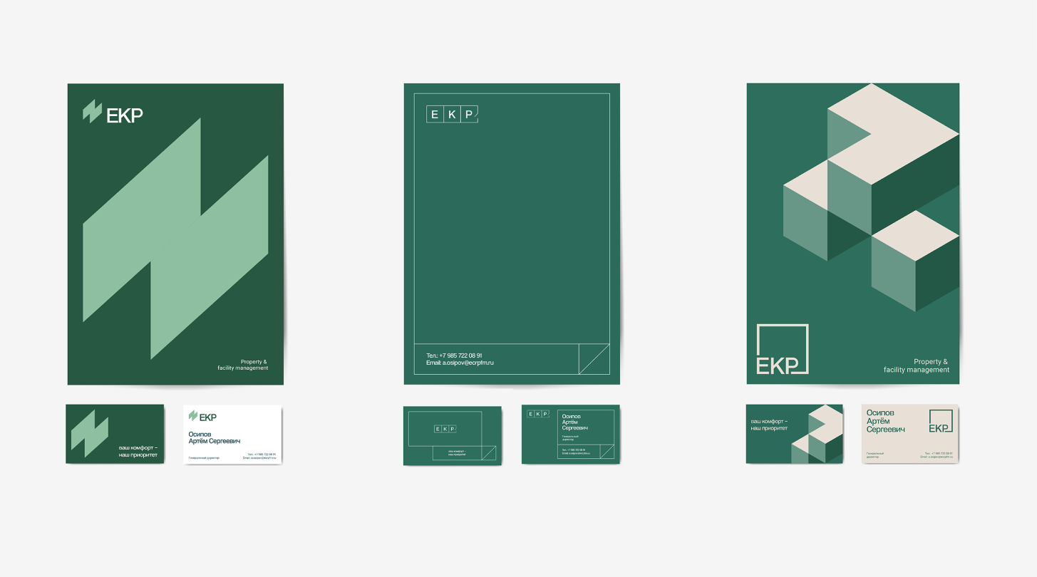
ECR
Briefly
This time, we created a corporate identity for ECR, a company that is an expert in commercial real estate management.
guideline,
branding,
graphic design

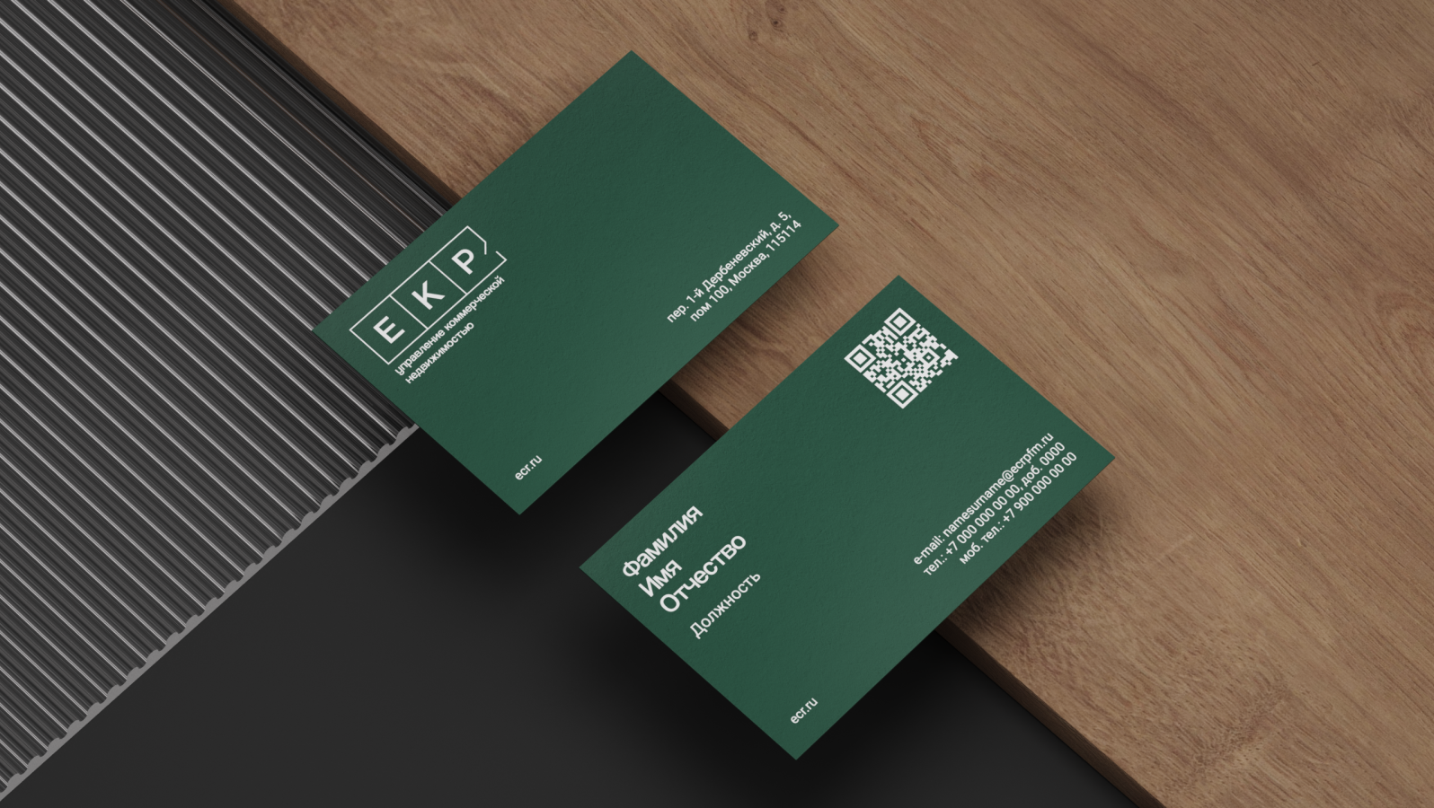
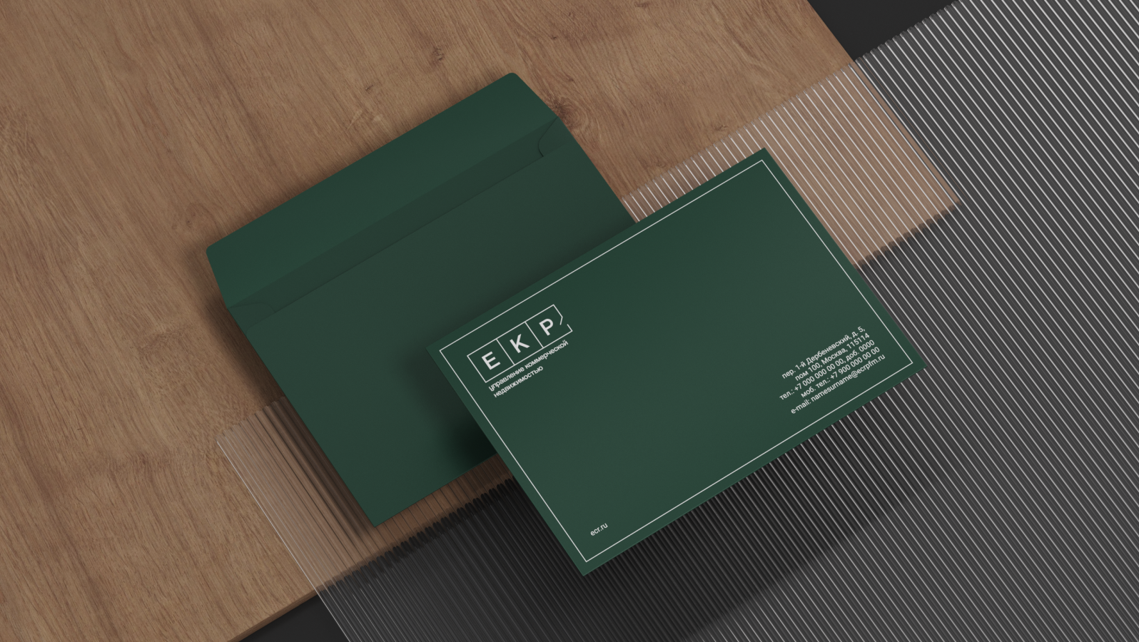
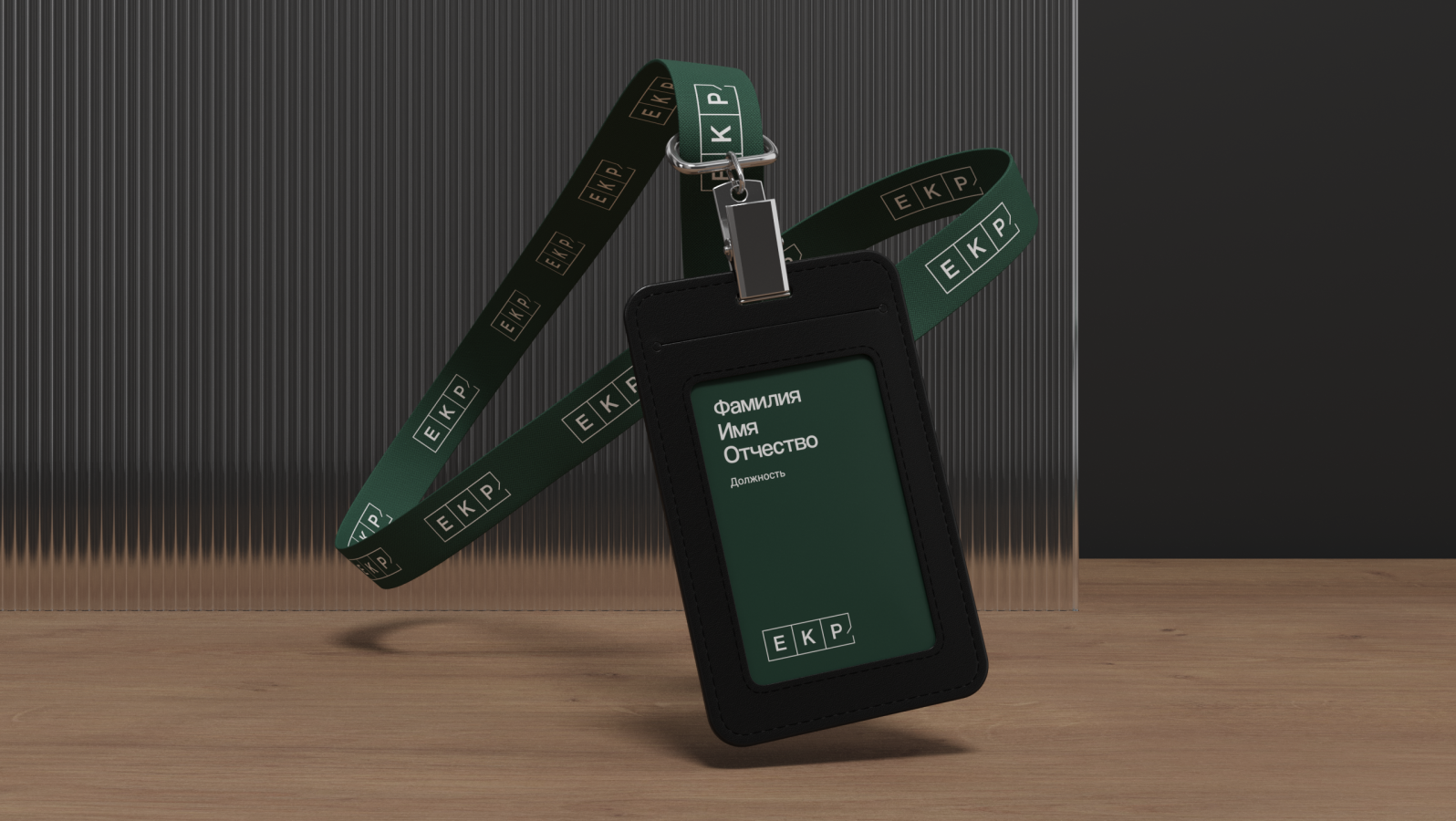
The logo references the layout of the space. Clean lines and harmonious details create the desired impression of reliability and comfort. And the grid of signature elements keeps everything organized and in order. We decided to enhance this effect with audio branding. First, the gentle sound of pencil on paper, then the final touch—and the doors of the space swing open. It's as if you've just entered a finished office, where everything is in its place and even the coffee is already brewed.
1. Process
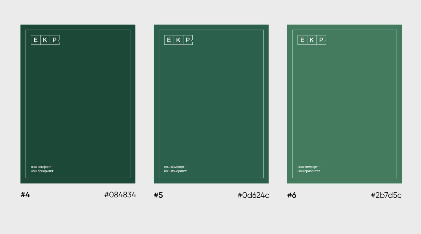
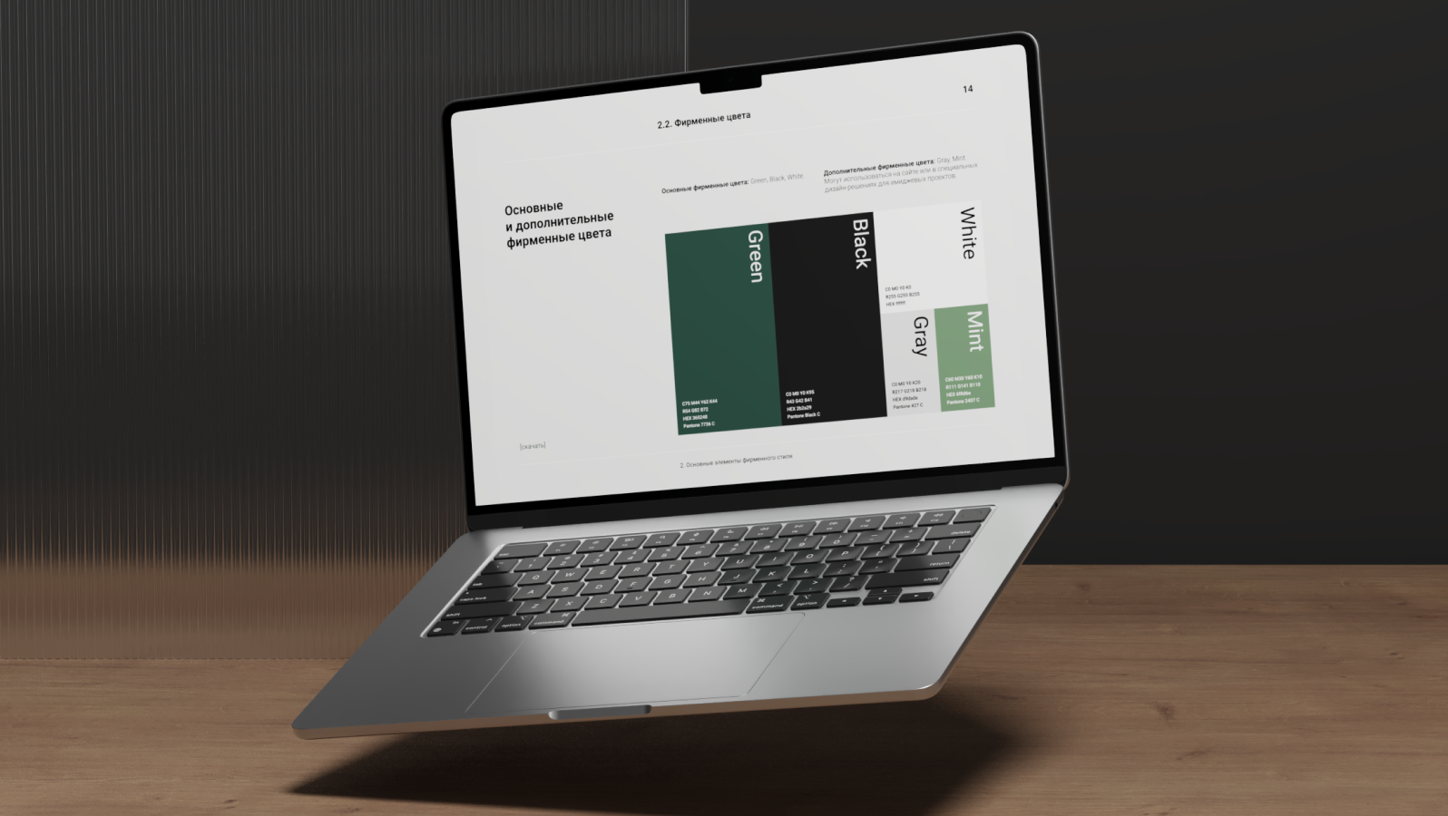
The concept of the EKR visual style is based on images of structure and comfort, combining clear geometric shapes, the harmony of rigorous organization, and a warm aesthetic to create a sense of reliability and professionalism. We first spent considerable time gathering references and materials to accurately understand the mood. Based on these inspiring examples, we began developing the logo and key elements of the corporate identity. We paid special attention to the shade of green—after testing and comparison, we found the one that best reflects the brand's character.
1/3
2. Result
Every detail in the graphics, sound, and animation supports the company's core idea: "We make business comfortable." The result is a corporate identity that is equally successful across all media and creates an image of a reliable and attentive partner.
1/4