

Rebranding of CS Medica and its packaging line
2025
Branding
Customer
CS medica
Briefly
CS Medica is a 35-year-old Russian company, a manufacturer and distributor of medical devices, operating in several key consumer categories. Due to ambitious sales growth plans, intense competition, and a product portfolio review, CS Medica required a visual update by 2025.
printing,
branding,
graphic design,
package
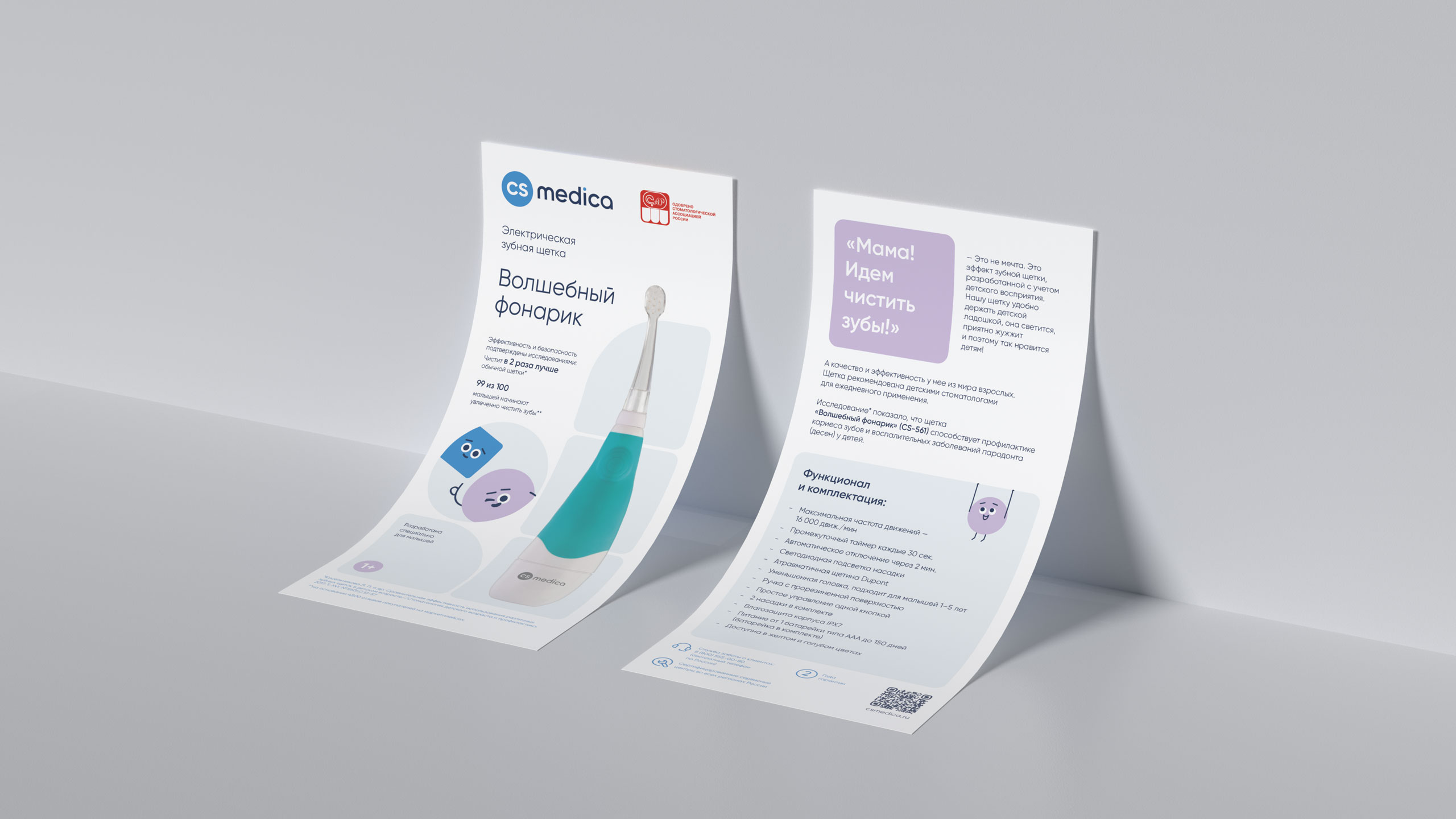
Based on the analytics, a brand concept was developed, including positioning, values, mission, and communication tone. The core idea: CS Medica is a friendly brand that turns health care into a comfortable habit. Positioning: devices that become part of family rituals and a doctor's choice. It draws on its medical origins as a sign of reliability and precision, with human emotionality—caring, modernity, and a family context.
1. Process
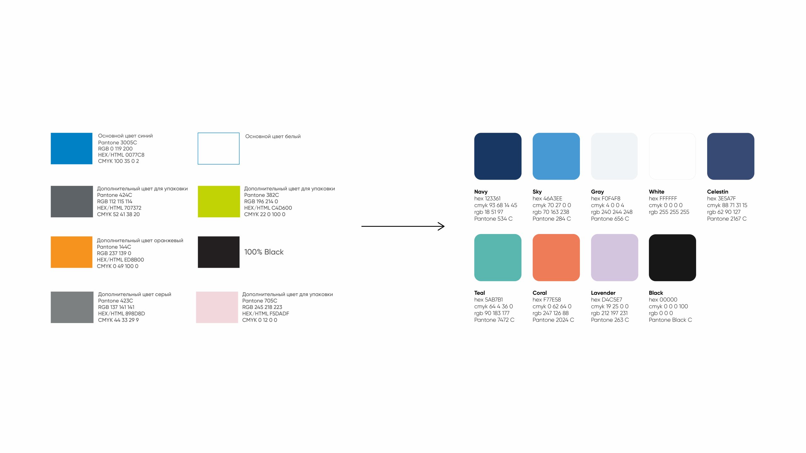
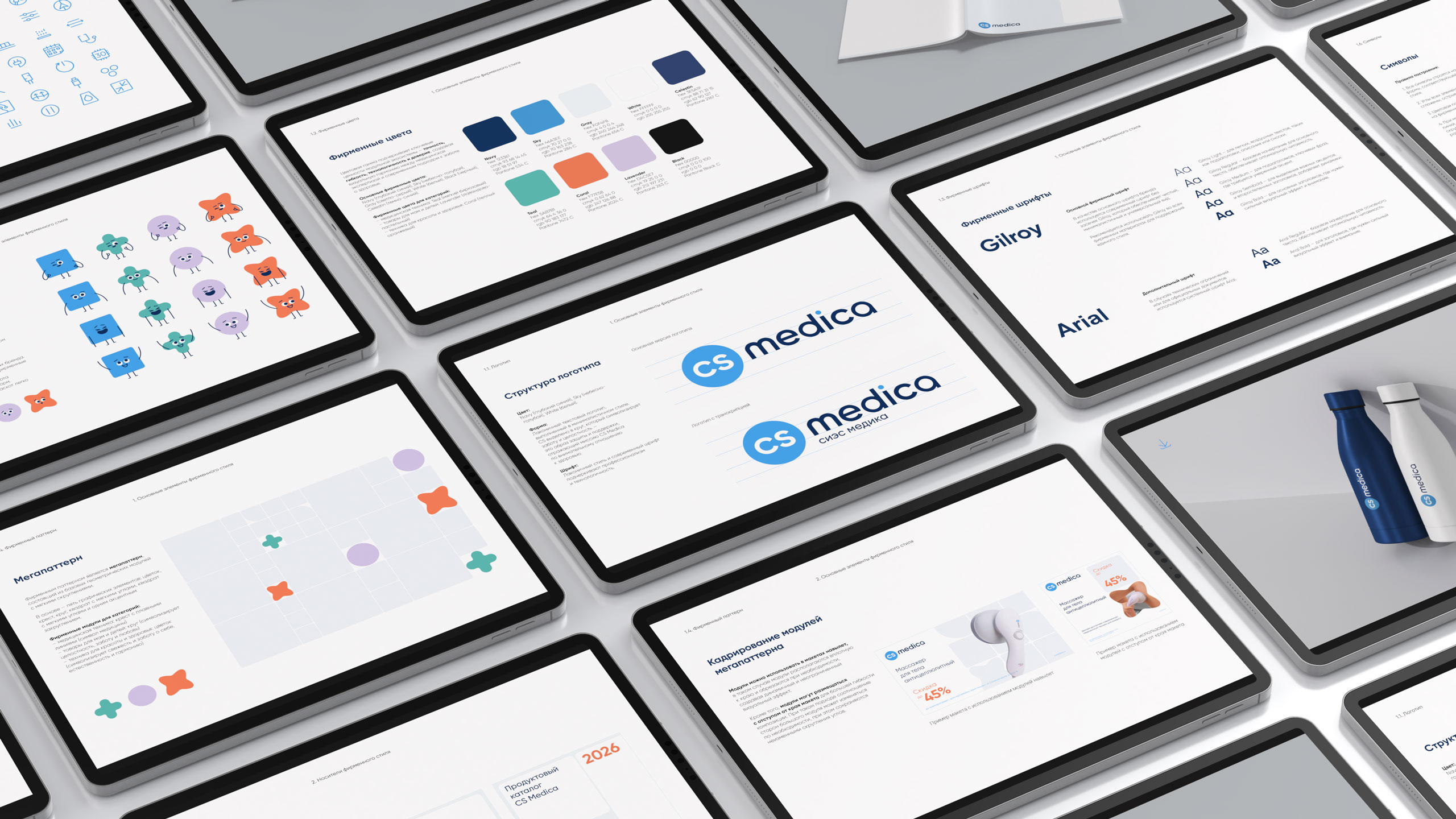
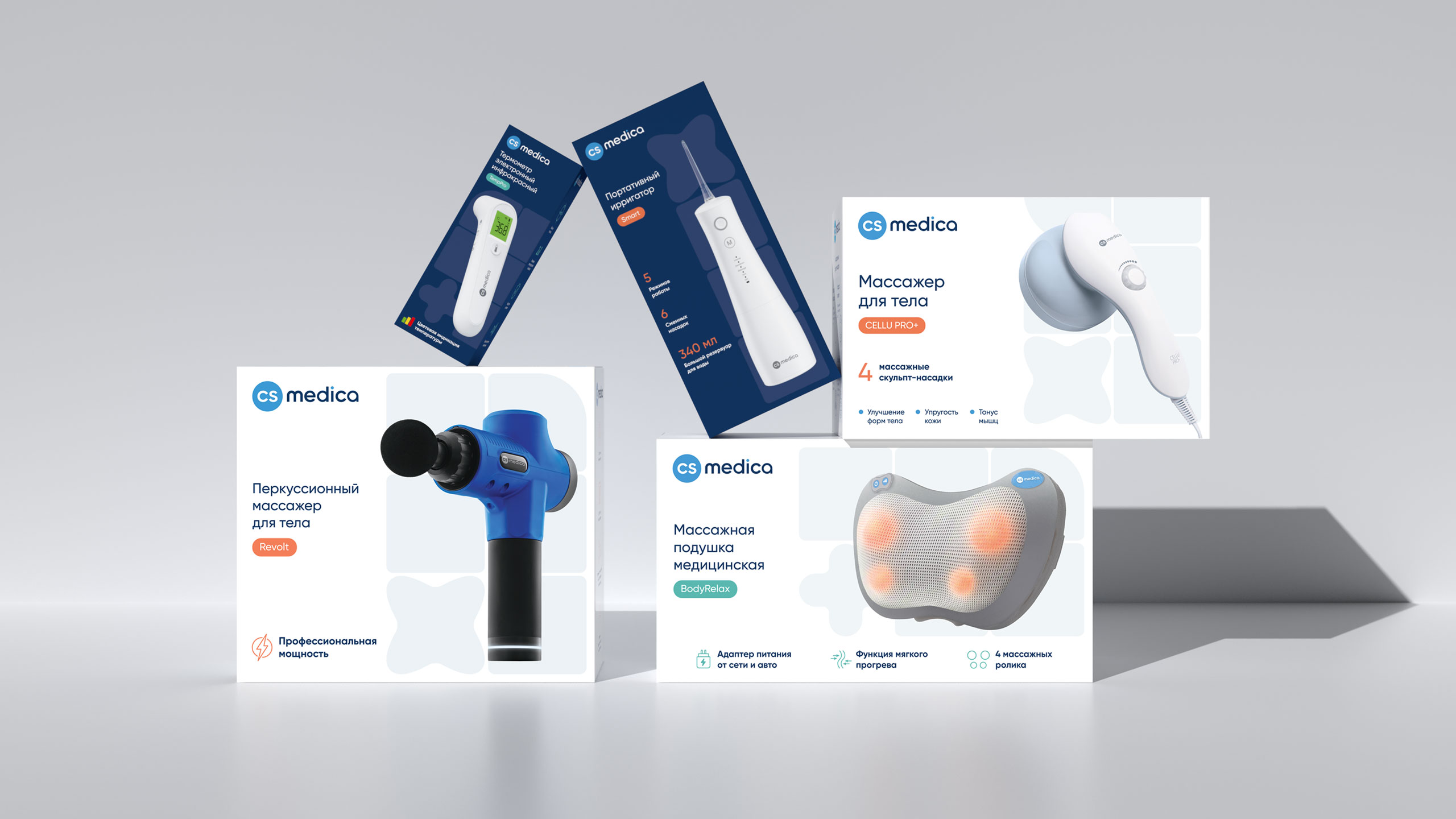
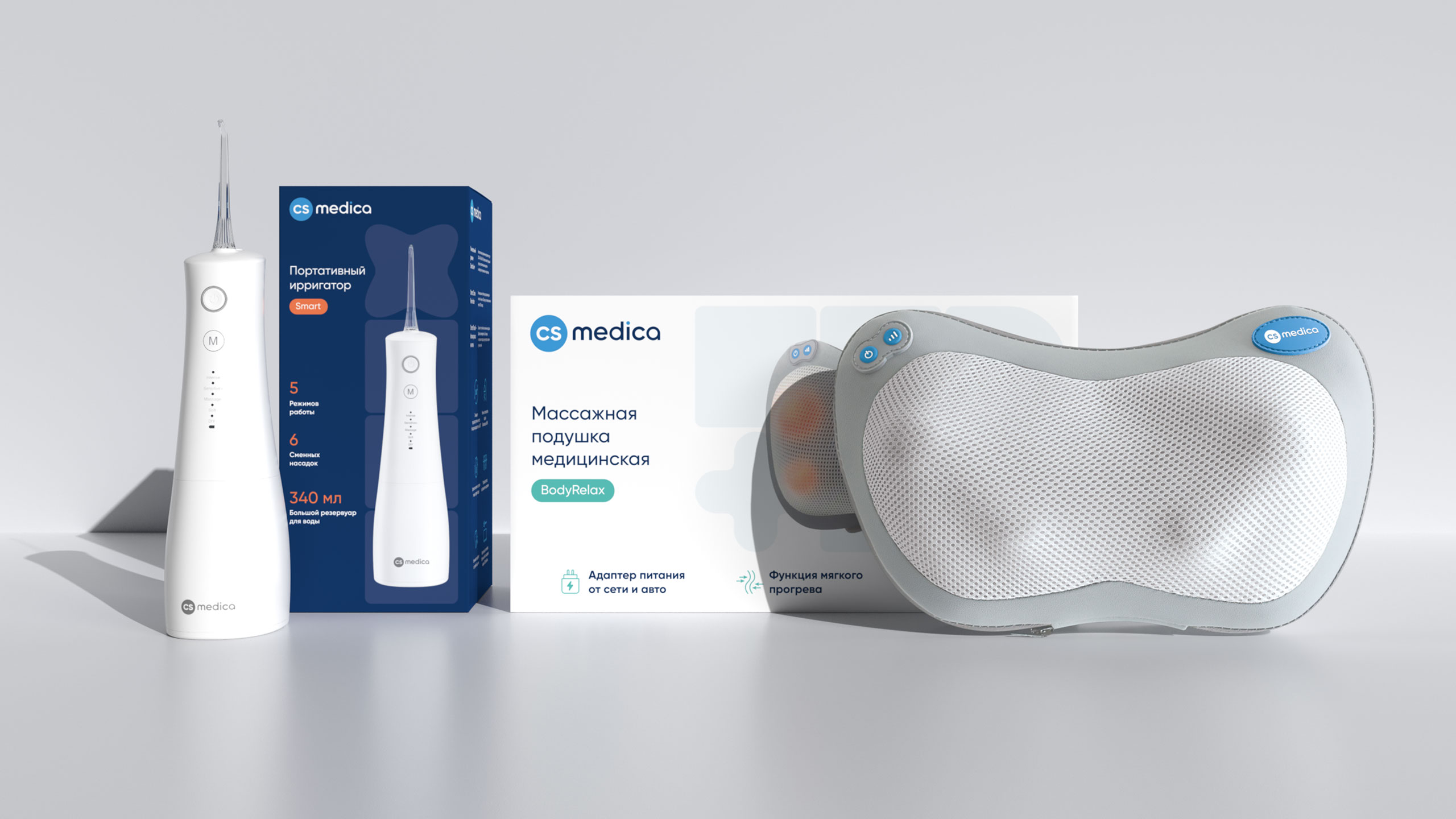
The project began with comprehensive market research and an analysis of the category's visual environment. We examined key competitors—B.Well, AND, Beurer, Xiaomi, and Pecham—based on their visual language, packaging structure, marketplace card logic, and communication techniques. This combined research defined the foundation of the future design system: a unified visual language for the entire product range, category differentiation through color, graphics, and tone, enhanced emotional appeal while maintaining medical authenticity, and a visual reflection of brand values. These characteristics were reflected in several visual concept variations developed by our team. Based on the client's chosen concept, a coherent visual system was created: patterns separate categories, color logic structures the product range, and graphics and typography ensure a unified brand perception. The system easily adapts to various formats and scales without losing recognition.

1/3
2. Result
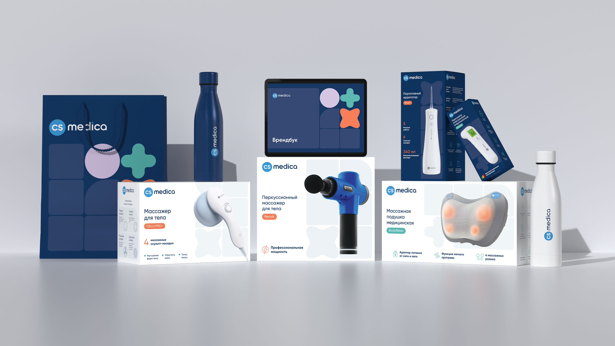
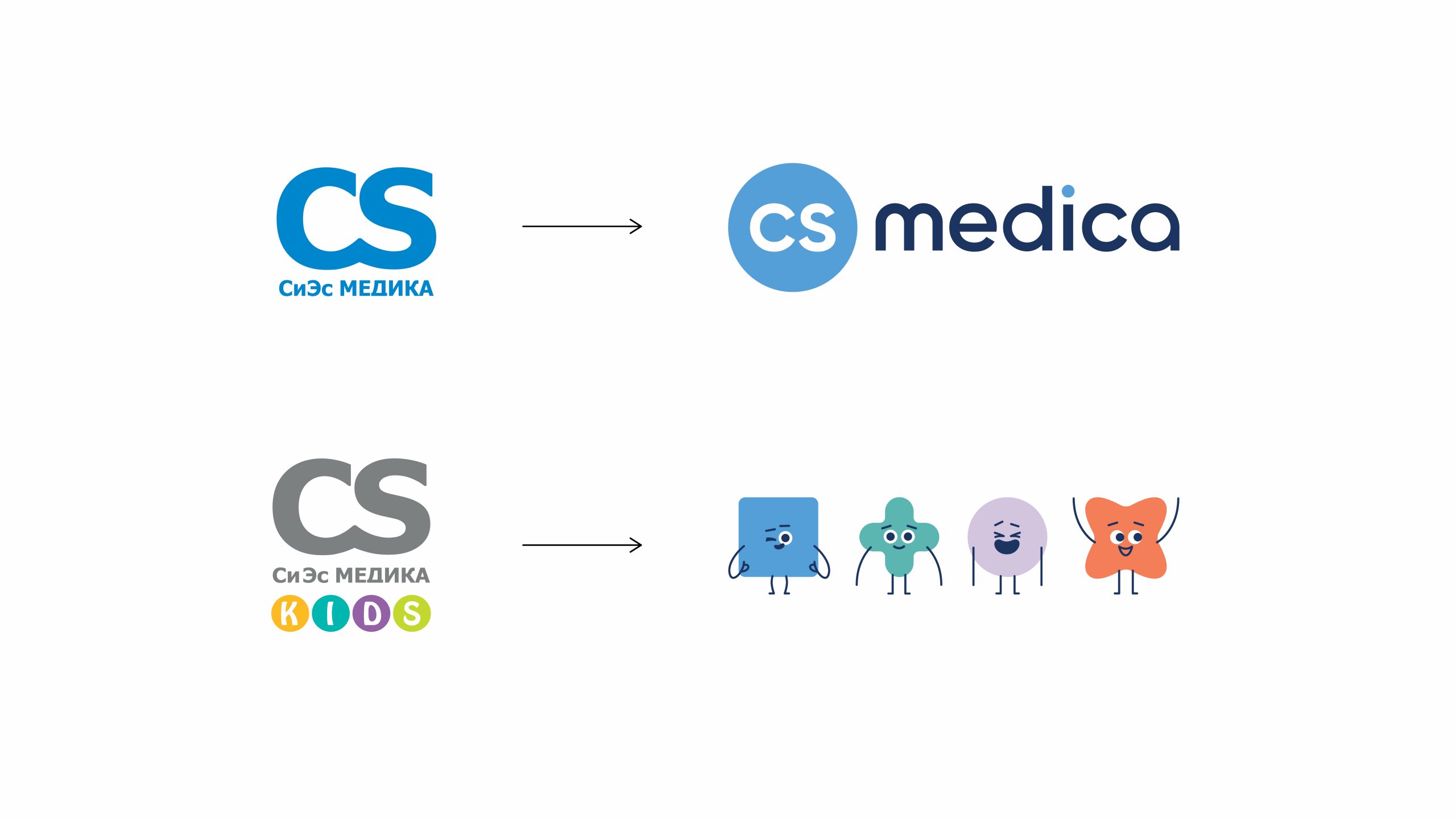
The project included the development of a comprehensive brand book for CS Medica, including the brand concept (main idea, positioning, values, mission, and tone of voice), key elements of the corporate identity, and guidelines for use across all media. A cohesive visual identity was created: an updated logo, font system, corporate pattern, mascots, graphic elements, and structured guidelines for the use of the identity.
1/6
Project team
Kostyuk Andrey
Art Director
Renzhina Veronica
Lead designer
Pospelova Sveta
Designer
Elana Ataeva
Designer
Muslimova Karina
3D designer
Alexander Gavrilov
Analyst
Savoskin Arseny
Project manager