
Rosatom brand book
Customer
BM Agency for the State Corporation Rosatom«
Briefly
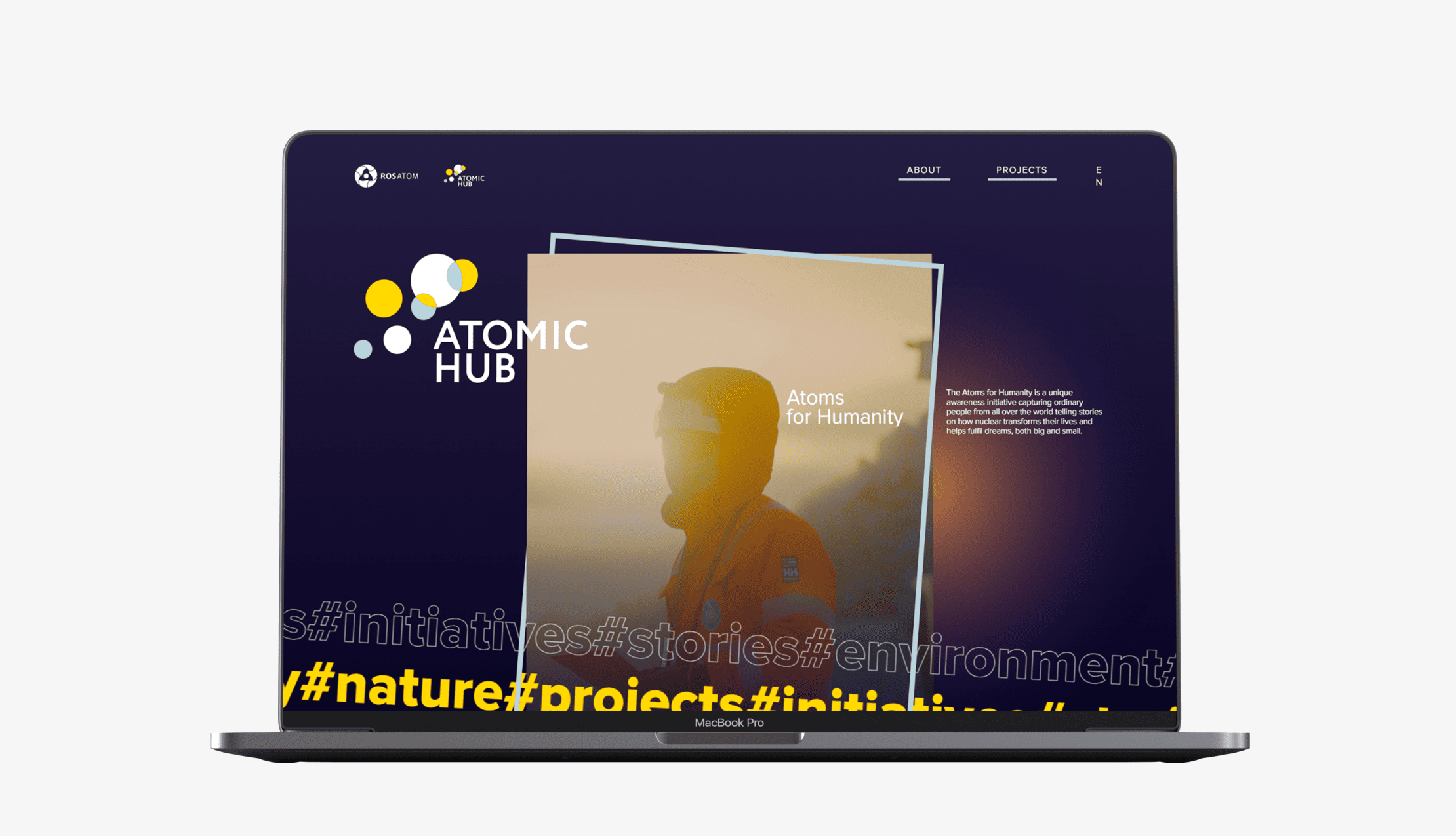
In 2019, as part of our work on the brand book, we created a new visual concept for the Rosatom State Corporation.
Want the same, but don’t know where to start?
Transform your ideas into a recognizable brand with us!
1. Search
The first task was to analyze the market and competitors, determine directions based on the client’s wishes, and create the first sketches of the conceptual element.

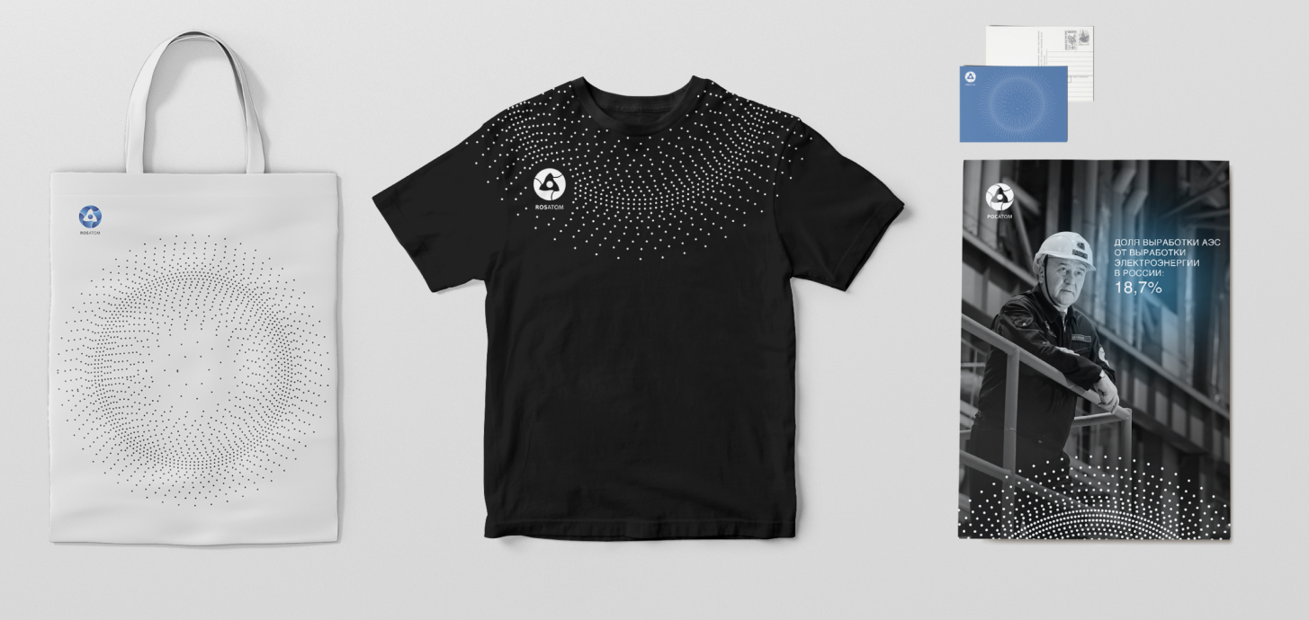

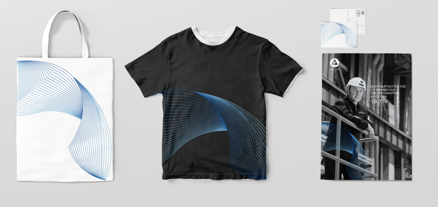


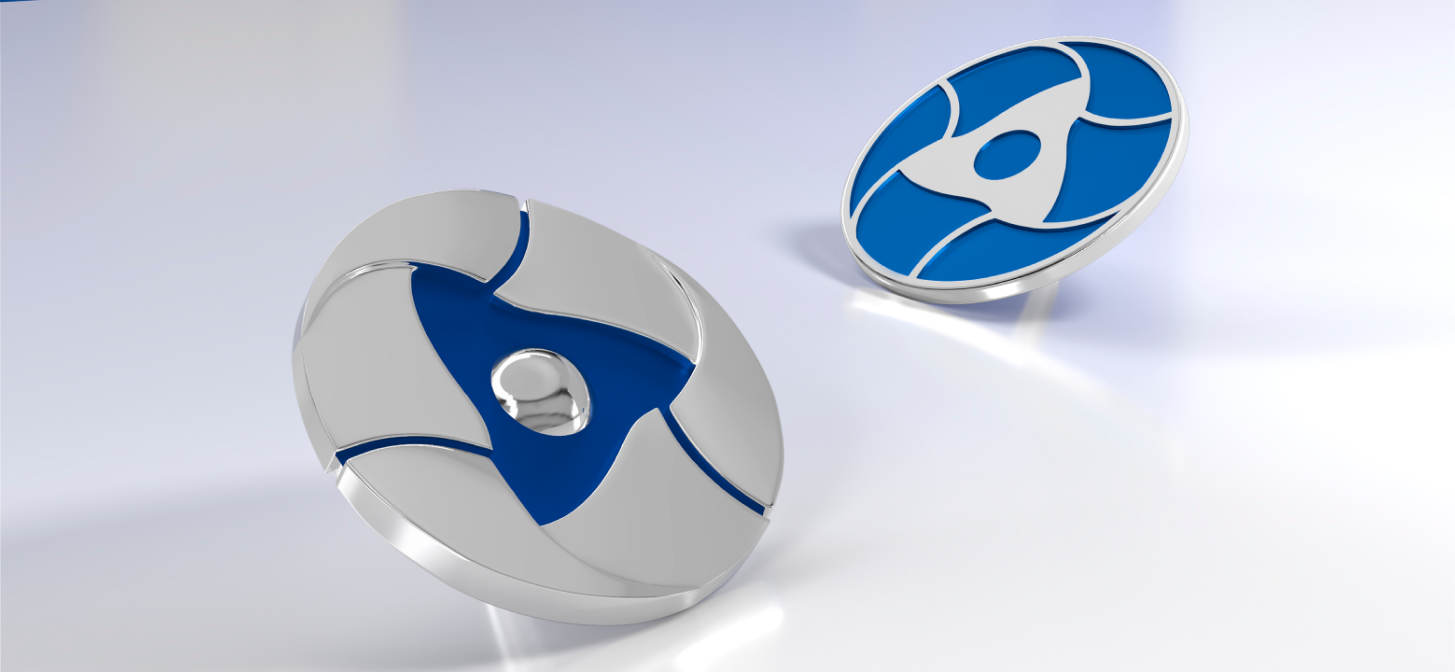
Approved version
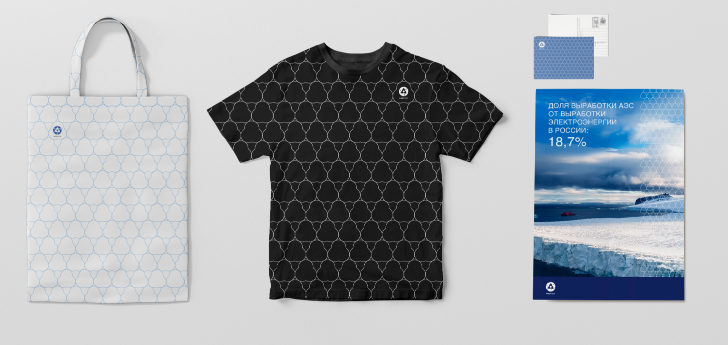
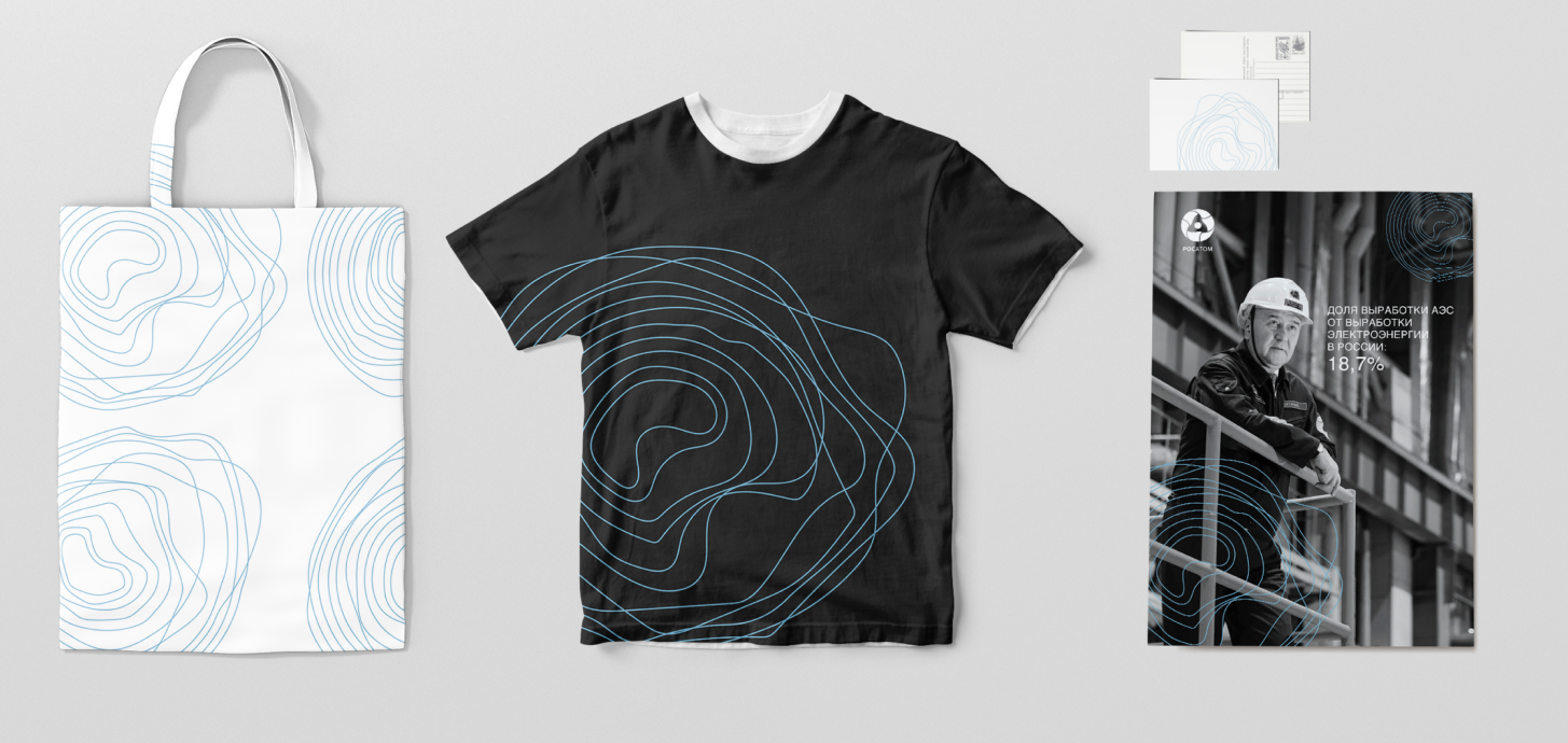
Ultimately, a modernized "Clean Wave" concept was chosen, transformed into a combination of two graphic objects that form part of the Rosatom State Corporation's logo—the Möbius strip. Two pattern types were developed: standard and additional ones.


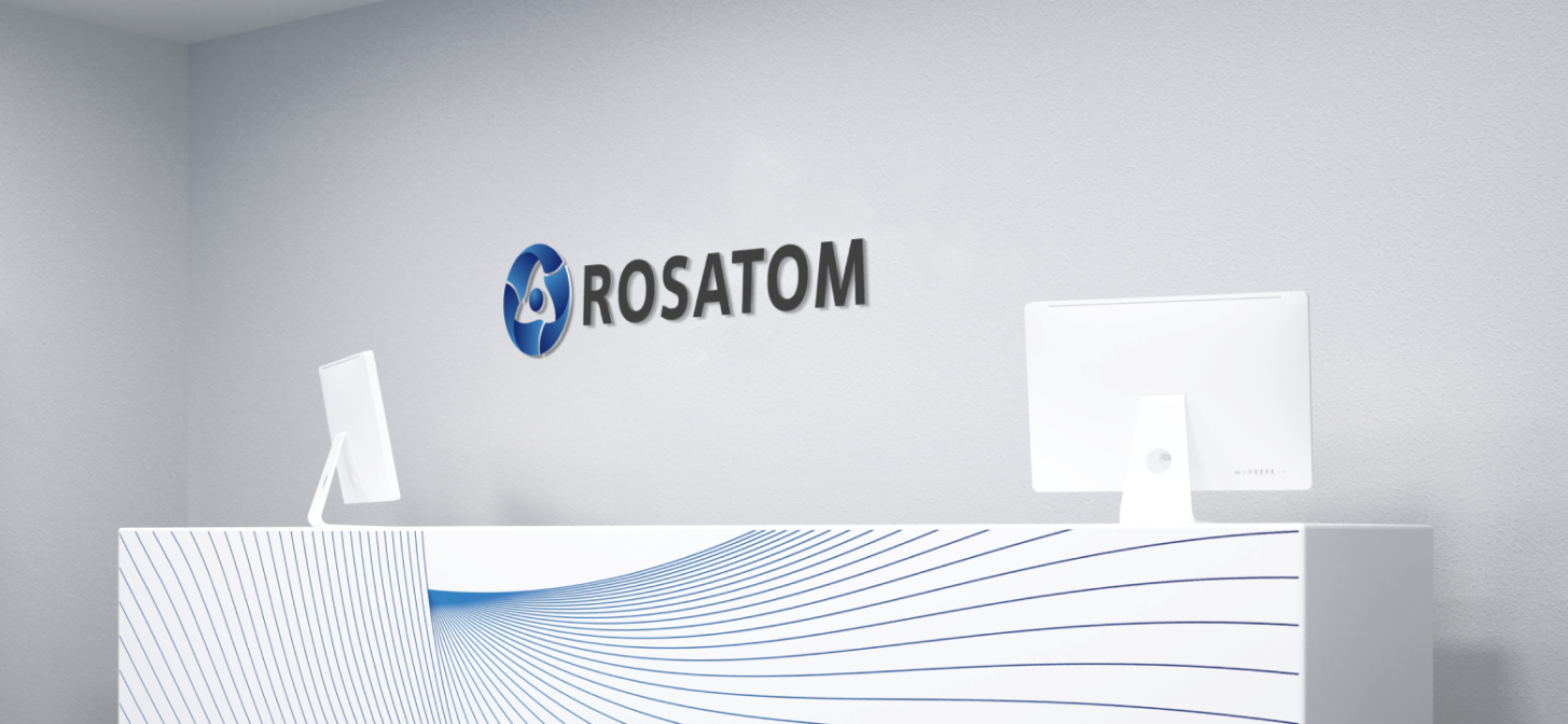
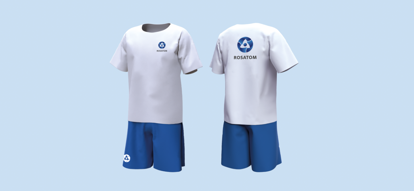
2. Carriers
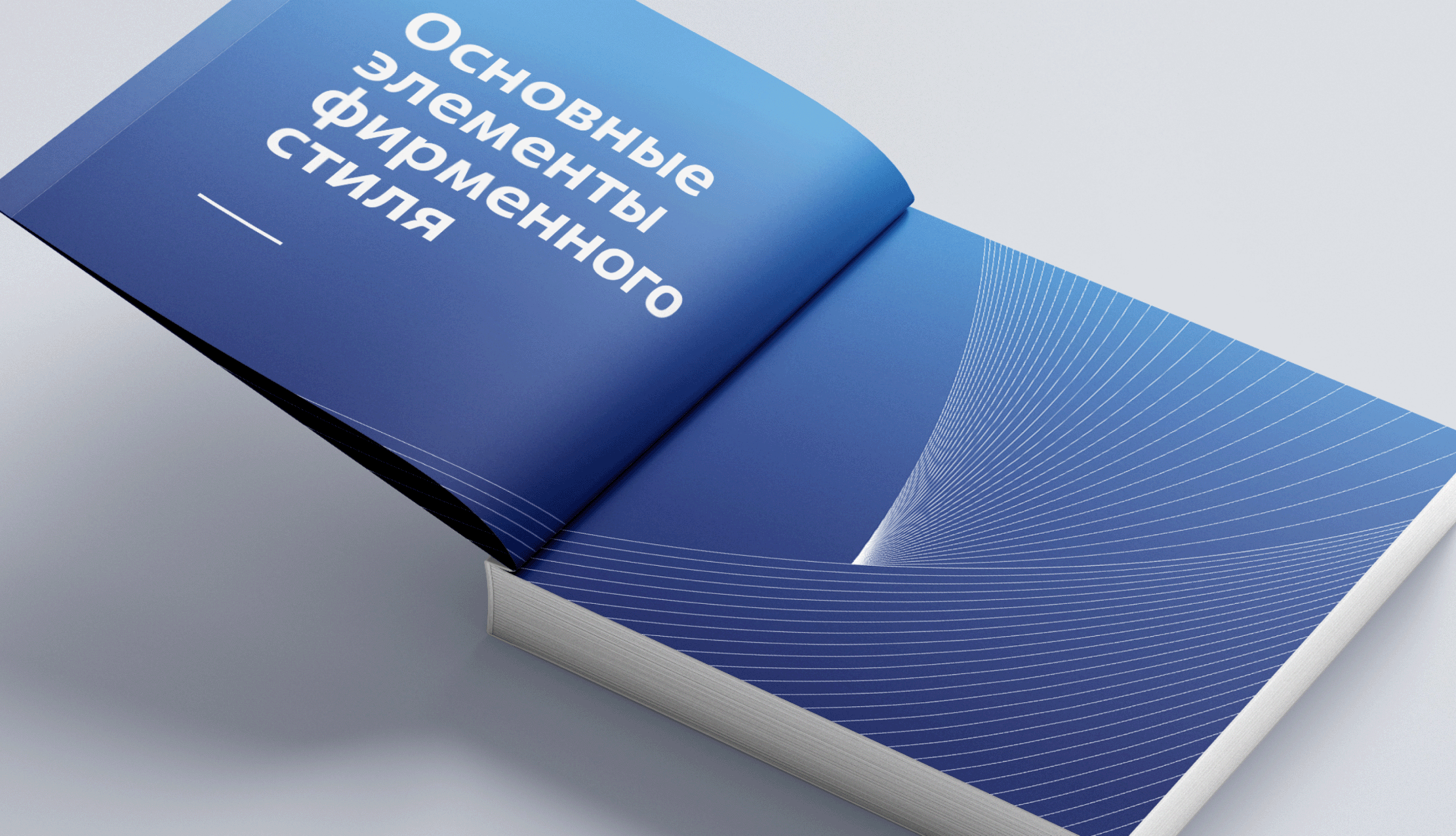
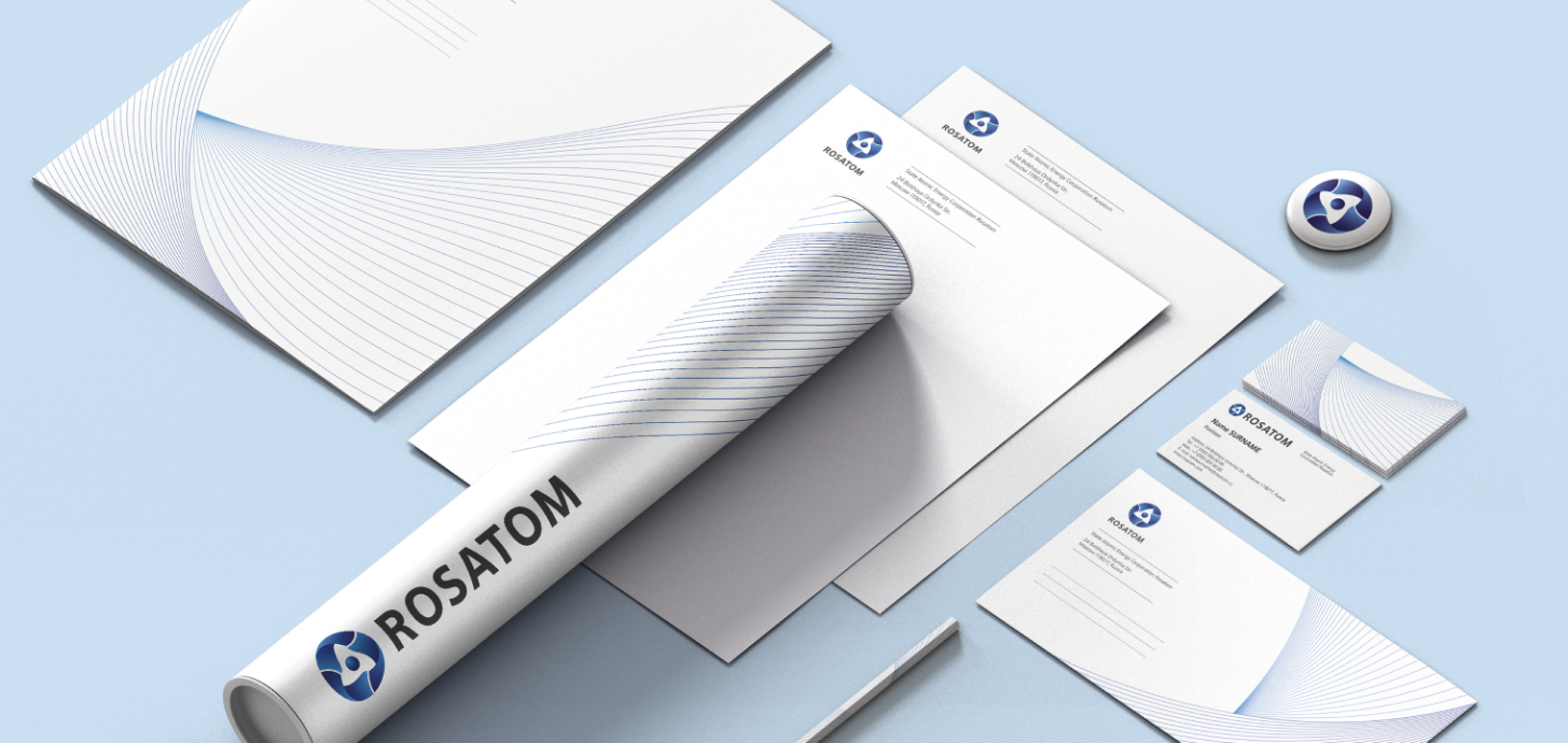
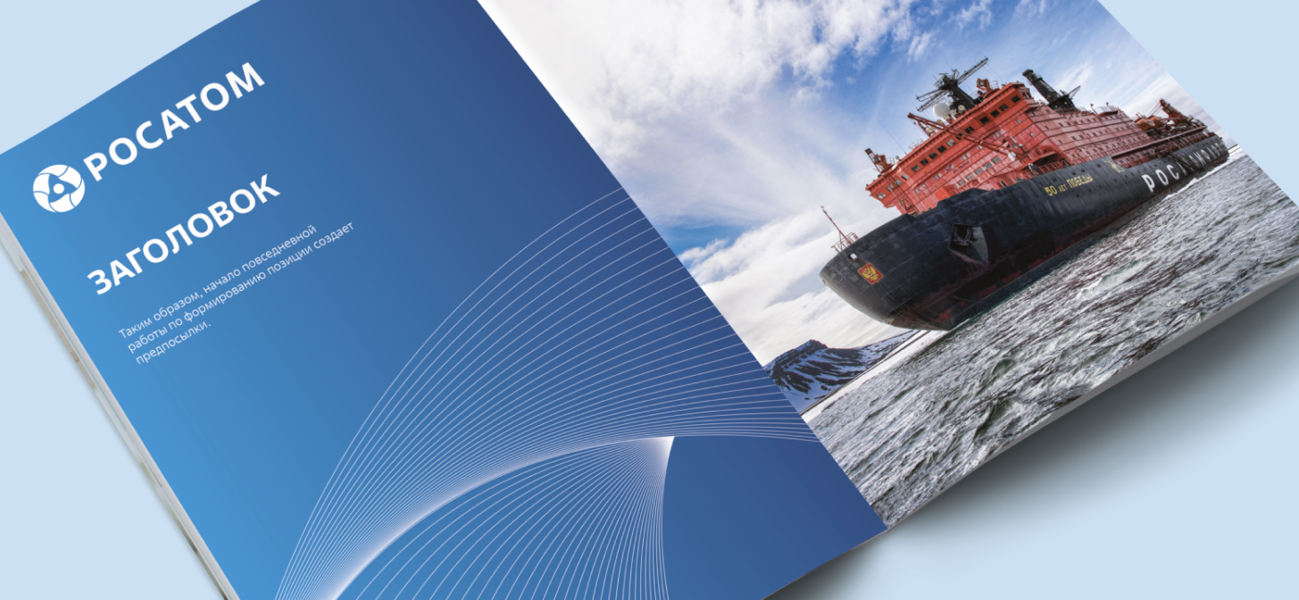
The formation of a recognizable image of the State Corporation Rosatom is achieved through the comprehensive and organized application of corporate identity elements (logo, pattern, corporate colors, corporate fonts, compositional grid) based on developed rules and recommendations for the design of corporate products.


3. Umbrella brand
Rosatom State Corporation organizations have transitioned to a unified brand. While maintaining their historical names and distinct identities, Russian nuclear industry organizations have adopted unified logos based on the Rosatom State Corporation trademark (the "Möbius strip").


The use of an umbrella brand in the nuclear industry will allow for the unified positioning of Rosatom organizations in domestic and international markets, which, in turn, will lead to increased recognition of Russian nuclear industry enterprises and their projects among partners and customers.