
Branding for the Dental Protection Society
Customer
Dental Protection Society
Briefly
We developed the naming, branding, and website for the dental clinic "Society for the Protection of Teeth"«
1. Naming
As a result of extensive research, analysis, and analysis, the client was offered more than 40 name options, including: Ortho Besto, Whitespiel, Zubrovnik, White Stone, Zub za Zub, etc.
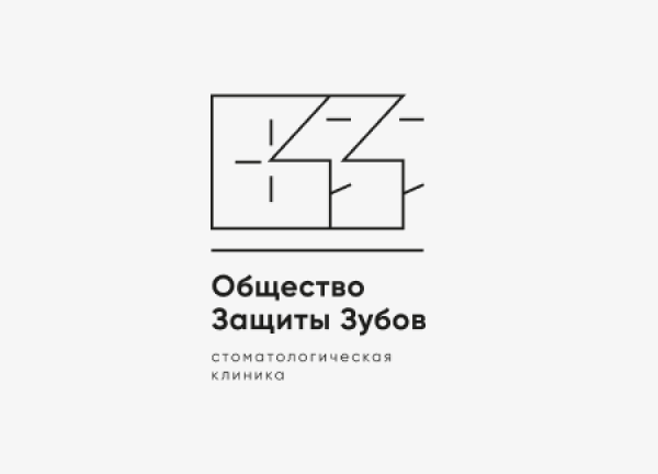
The "Society for the Protection of Teeth" option was declared the favorite. Its advantages included the catchy and potentially visually applicable abbreviation "OZZ," a built-in ironic element, and a metaphorical reference.

2. Logo
The key reference in the logo's visual concept was the brand's iconic abbreviation, "OZZ".
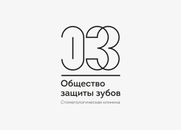
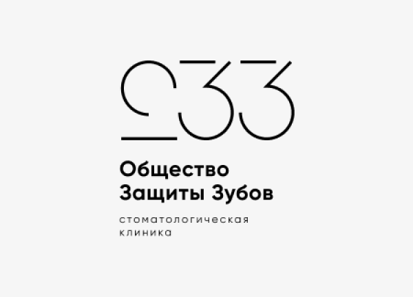
The entire process of working on the logo developed around the play of forms (geometric figures) and images that were born in the process of combining elements – symbols of smiling faces

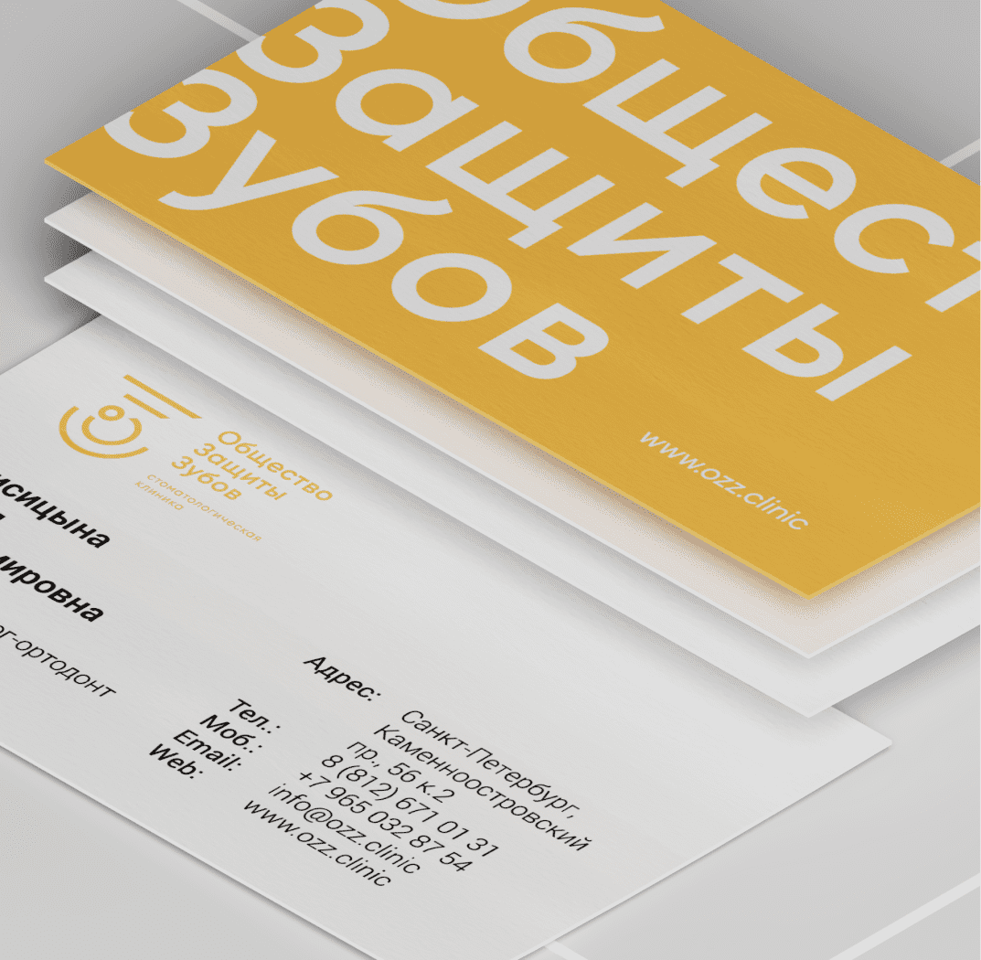
3. Branding
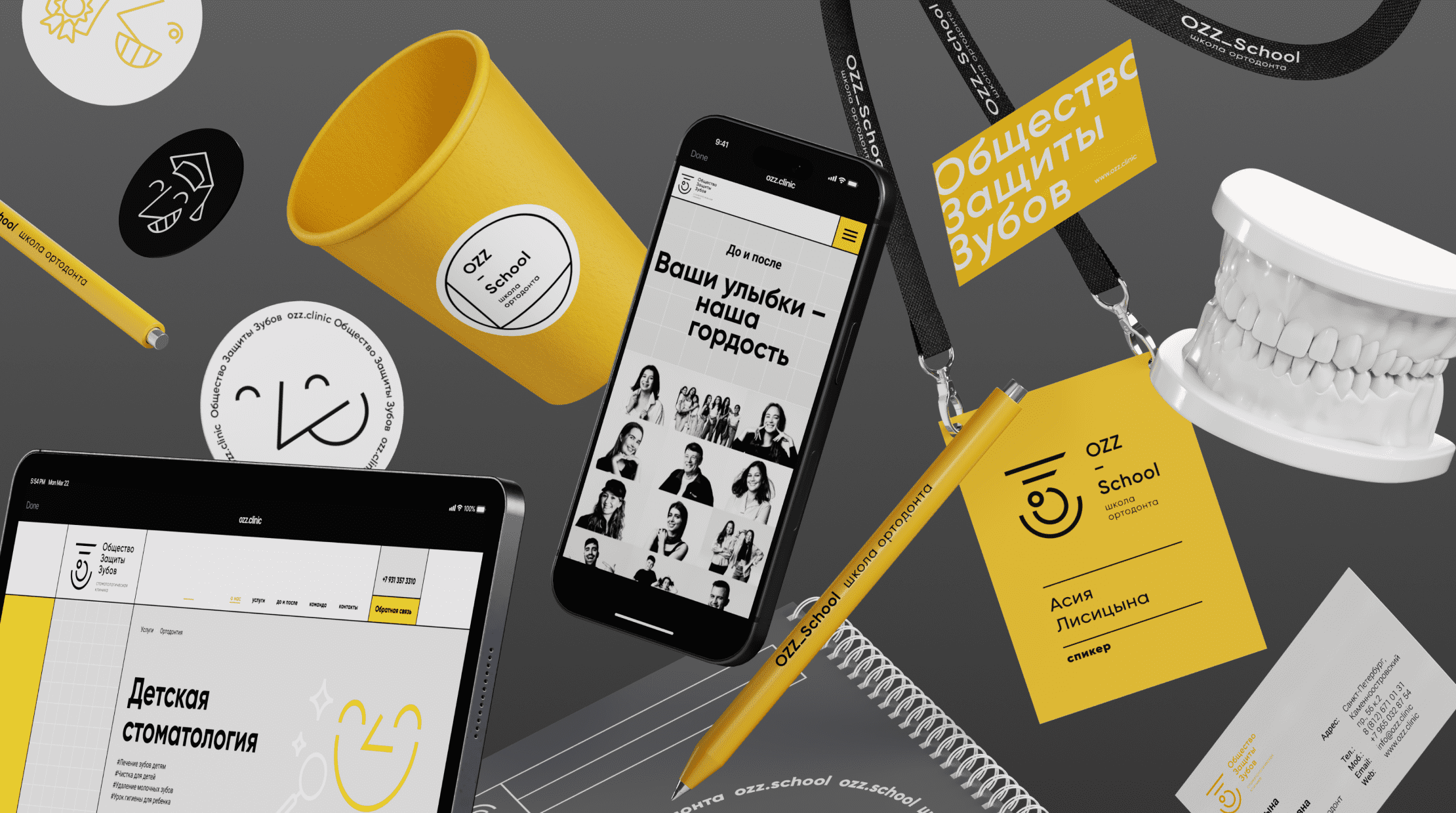
The logo's imagery evolved through the brand's signature graphics—a series of faces with various circular configurations. Visual support was provided by a typographic block evolving along an arc and a grid matrix. The concept was further developed in the brand's printed materials, navigation and information systems, website, and the clinic's subbrand, the OZZ School orthodontic school.
3. Branding
The logo's imagery evolved through the brand's signature graphics—a series of faces with various circular configurations. Visual support was provided by a typographic block evolving along an arc and a grid matrix. The concept was further developed in the brand's printed materials, navigation and information systems, website, and the clinic's subbrand, the OZZ School orthodontic school.


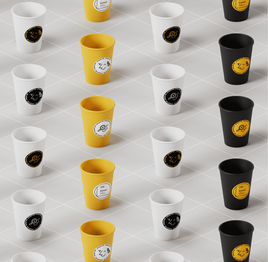
4. OZZ.School
The clinic's visual concept was further developed through the brand's printed materials, navigation and information systems, website, and the implementation of the clinic's subbrand, the OZZ School orthodontic school. Key elements of this concept included social media posts, handouts and accompanying materials, and merchandise.


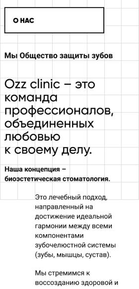
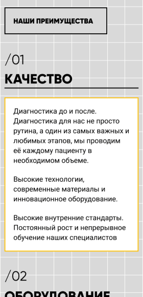
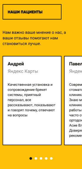
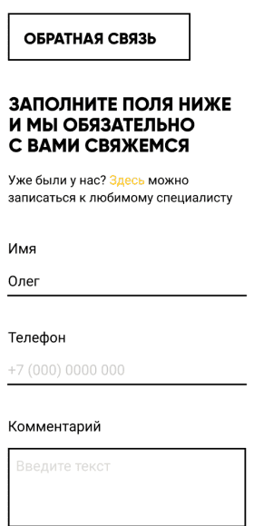
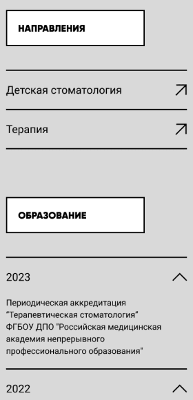
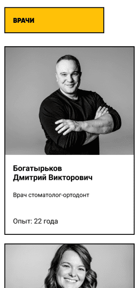
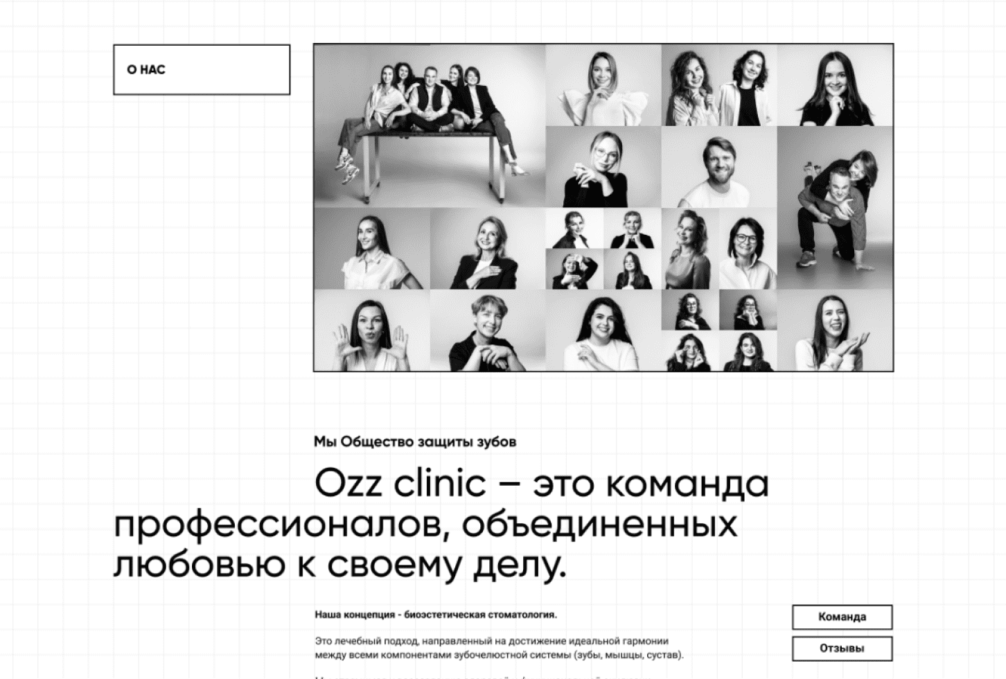
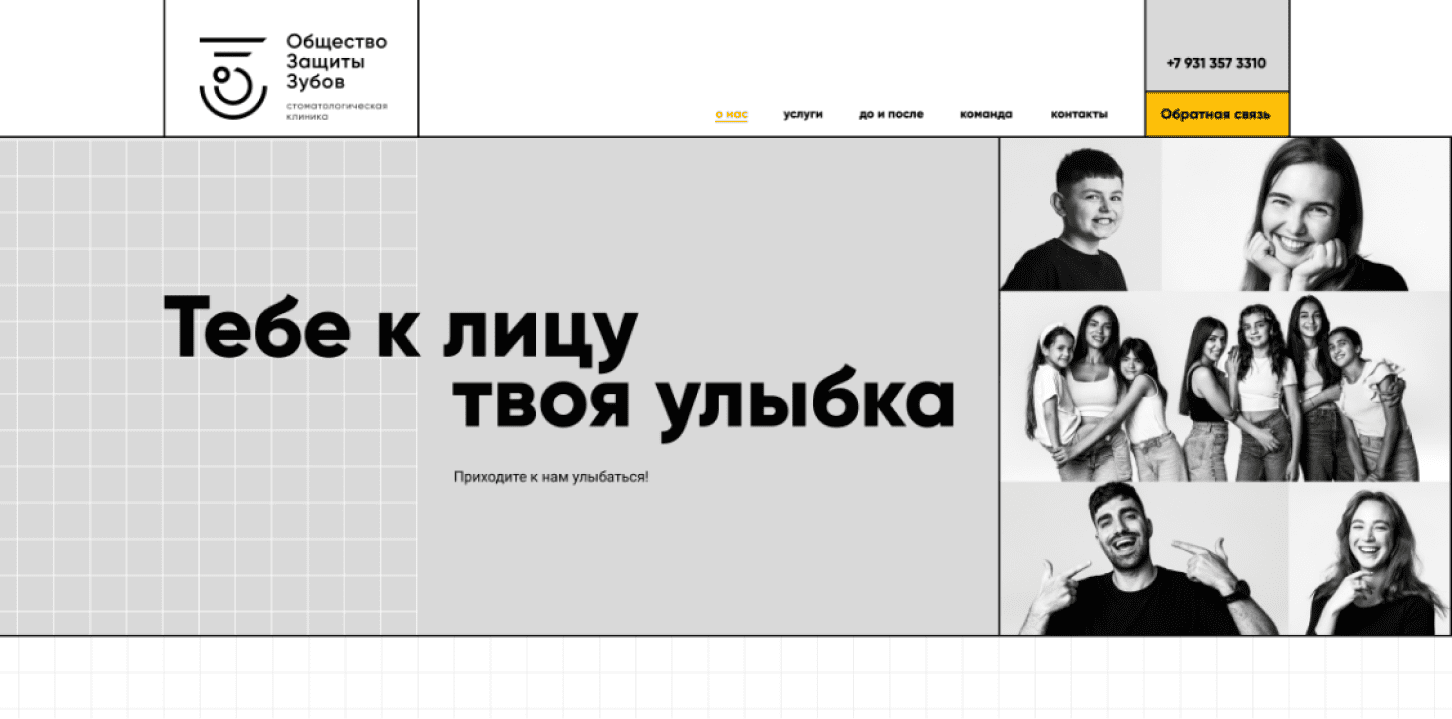
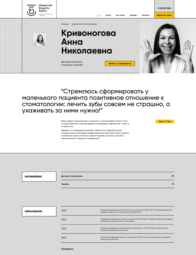
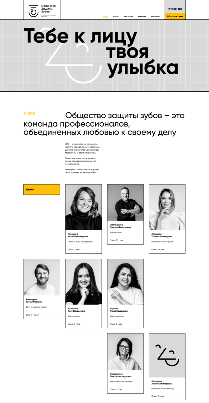
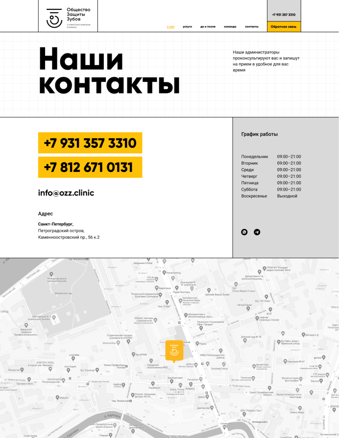
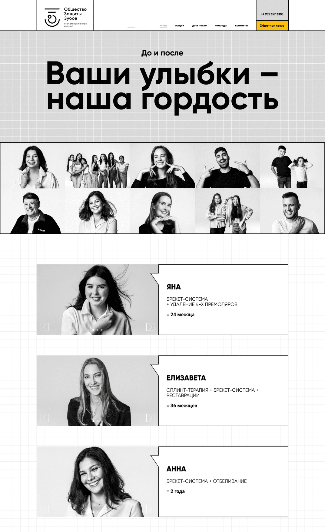
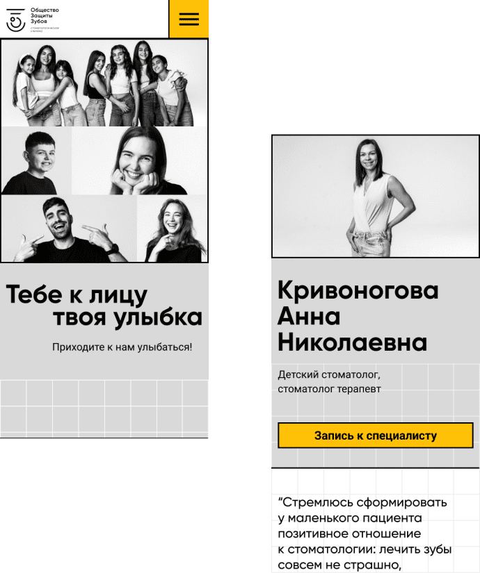
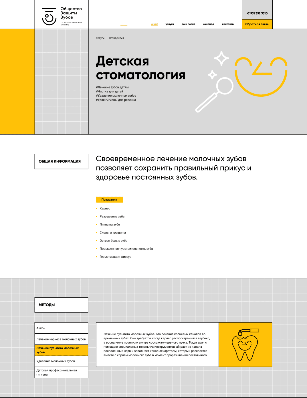
5. Website
In developing the website, it was important to maintain the continuity of the OZZ style. To emphasize its positioning, a non-standard compositional grid, accent typography, and photographs of doctors and patients were used, serving as the central visual communication through the display of vivid emotions.