
Development of exhibition stands for the Rosatom State Corporation«
2019
Spatial design
Customer
Advertising agency "White Bear" for the State Corporation "Rosatom"«
Briefly
In 2019, we designed and developed 13 exhibition stands, created a multi-page manual, and supporting materials for the Rosatom State Corporation.
guideline,
branding
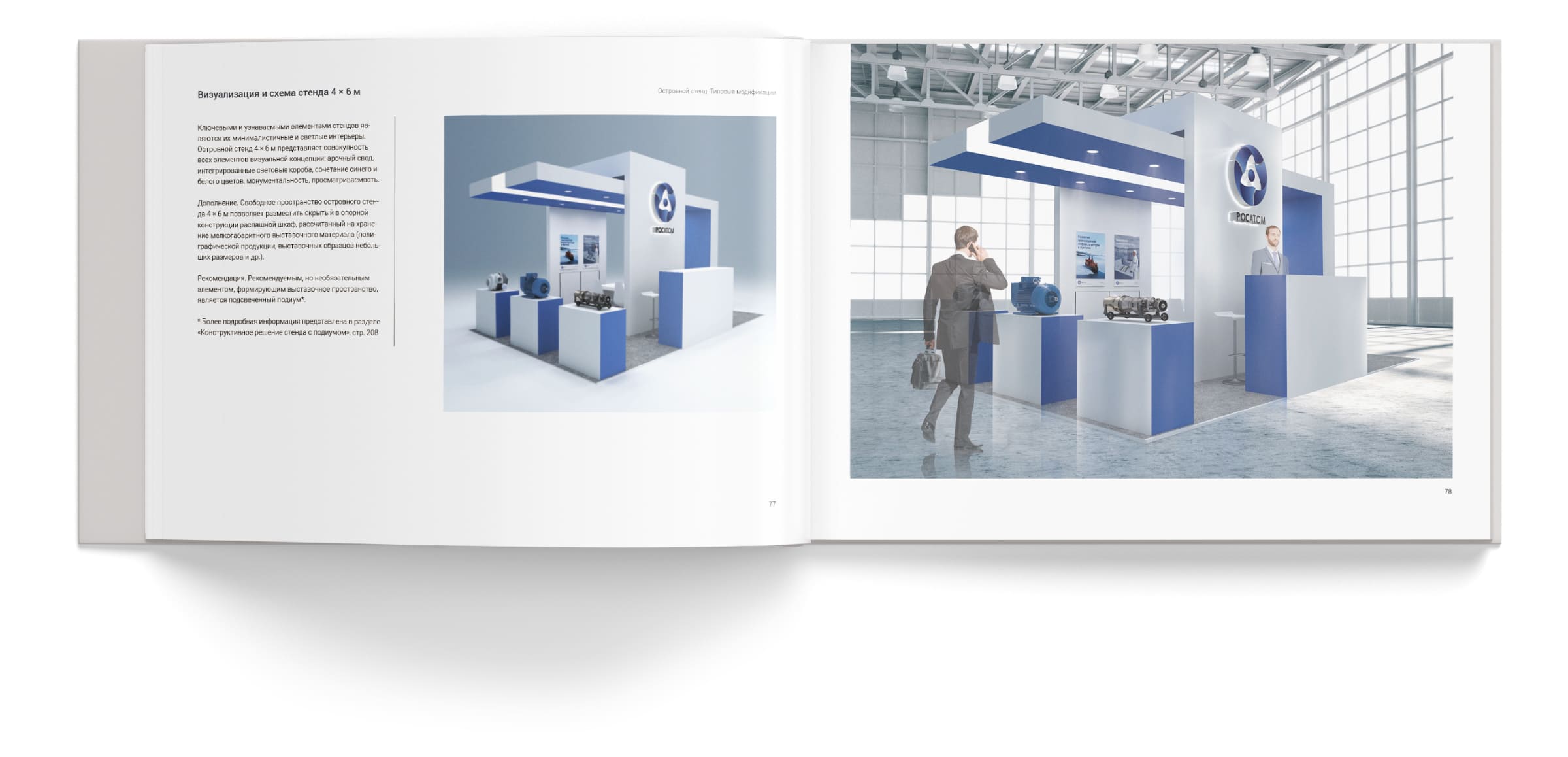
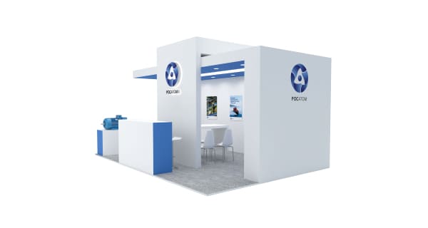
The exhibition space's design concept demonstrates the company's openness; straight, clear lines emphasize confidence in the company's chosen path, while the color scheme reflects the purity inherent in nuclear energy.
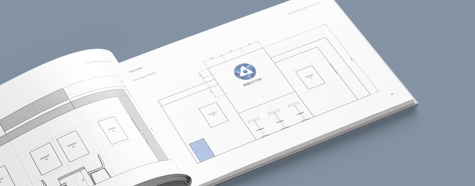
The stand's key feature is an arch, extending like a bridge, symbolizing unity and movement toward the new. The guidelines included diagrams of each stand in various projections, equipment drawings, working documentation, materials, multimedia, furniture, lighting, mobile structures, promotional clothing, and a calculation of the total construction costs.


1/6